NotNeutral REBRAND
While working in RIOS in 2020, I was took part in creating graphics for the new NotNeutral Rebrand. I’ve been able to use my knowledge in Rhino3D to aid my creation of the vector diagrams of the NotNeutral products. They were later incorporated into the packaging and pamphlet designs. Our team launched the rebrand at the beginning of 2021.
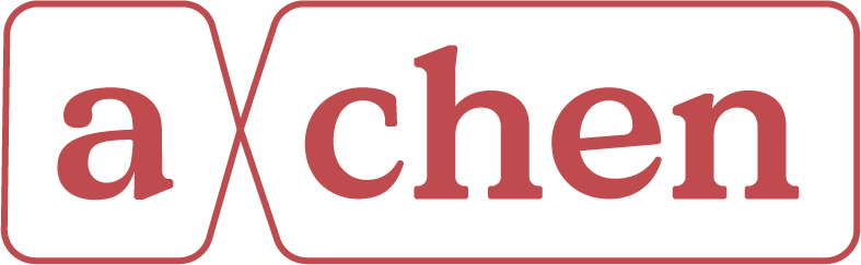
The brand is an aesthetic marriage of precision and humanity that reflects notNeutral’s products and process: they are rigorous in their technique but leave space for an element of surprise, beauty, and delight.
The logo communicates this dichotomy by combining an underlying structure preserving the weight and distribution inherent in penmanship with a series of logical and consistent angles and curves.


The color palette is primarily high contrast black and white to emphasize the technical expertise, with pops of color that highlight the most important elements of their innovative product designs. The entire catalog of icons was redrawn in a refreshed style that is consistent, purposeful, and simple. Finally, we outlined a new photography style which emphasizes the humanity (and humans!) behind notNeutral’s products: using realistic natural lighting for product shoots, incorporating the people behind their products and the customers who use them, and breathing life into the products by showing them in motion.
